Design System Creation
Getting Design and Engineering on the same page
The Context
We engaged with a client that was supporting an organization's web app, without any Design System in place at all. Even worse, the designers worked in completely siloed local Sketch files and were attempting to manage version control via a shaky Sketch plug-in. We needed a massive overhaul, quick!
The Challenges
- Designs were neither consistent with the current product nor other contemporaneous designs, causing frustration and confusion with software engineers and QA.
- Designers had little insight into how the codebase was set up, leading to non-standard design approaches that were not feasible and constantly needing rework. Cross-functional conversations around feasibility were endless and exasperating.
- Each design was a patchwork of elements copied and pasted from previous designs, irrespective of updates that may have occurred in the meantime.
Translation and Creation
- Two Week “Design Freeze”
Leveraging the “Code Freeze” concept, we carved out a cycle where we established that no new designs would be kicked off, and our efforts would be focused on translating recent designs from Sketch to Figma. - Component Creation
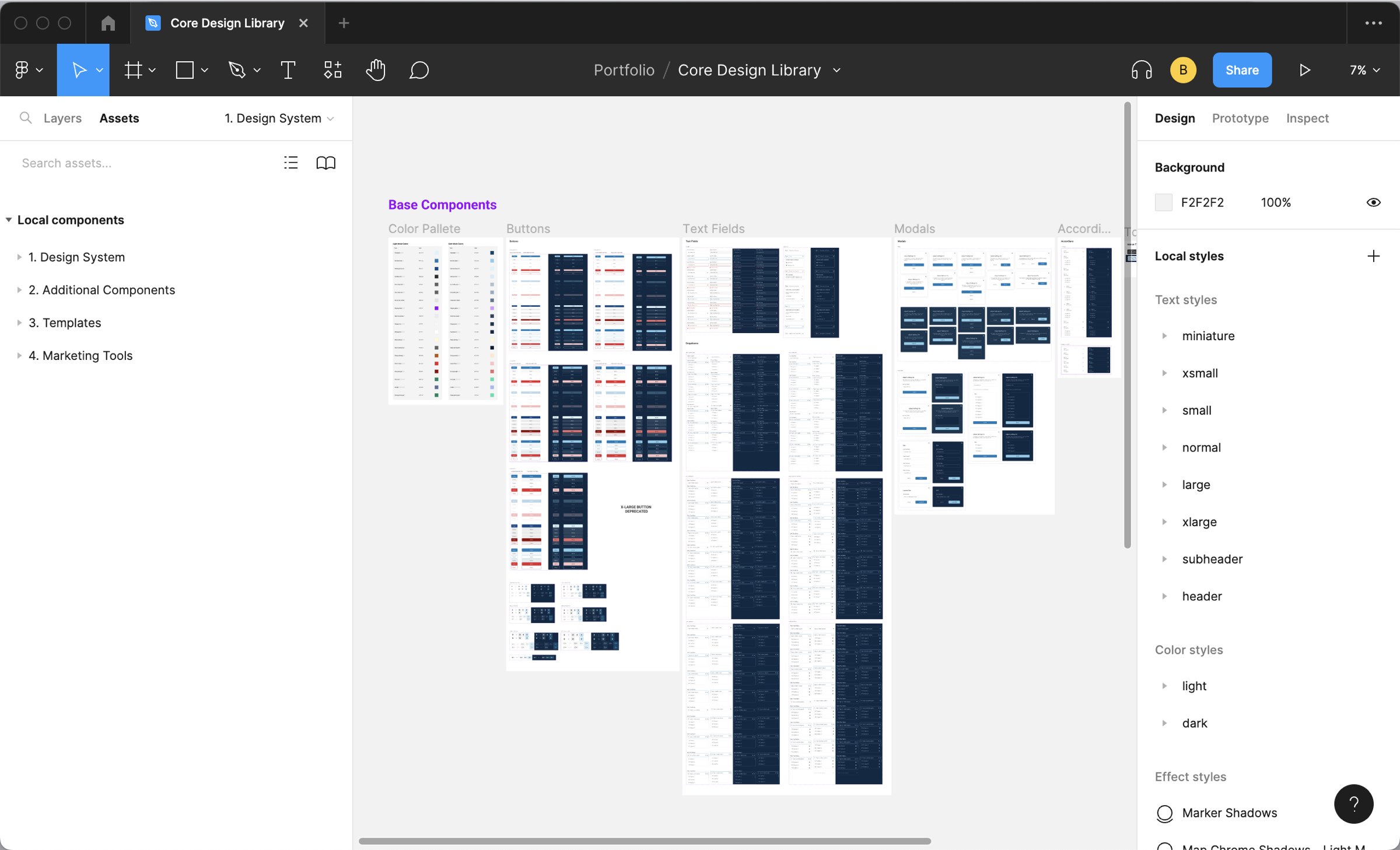
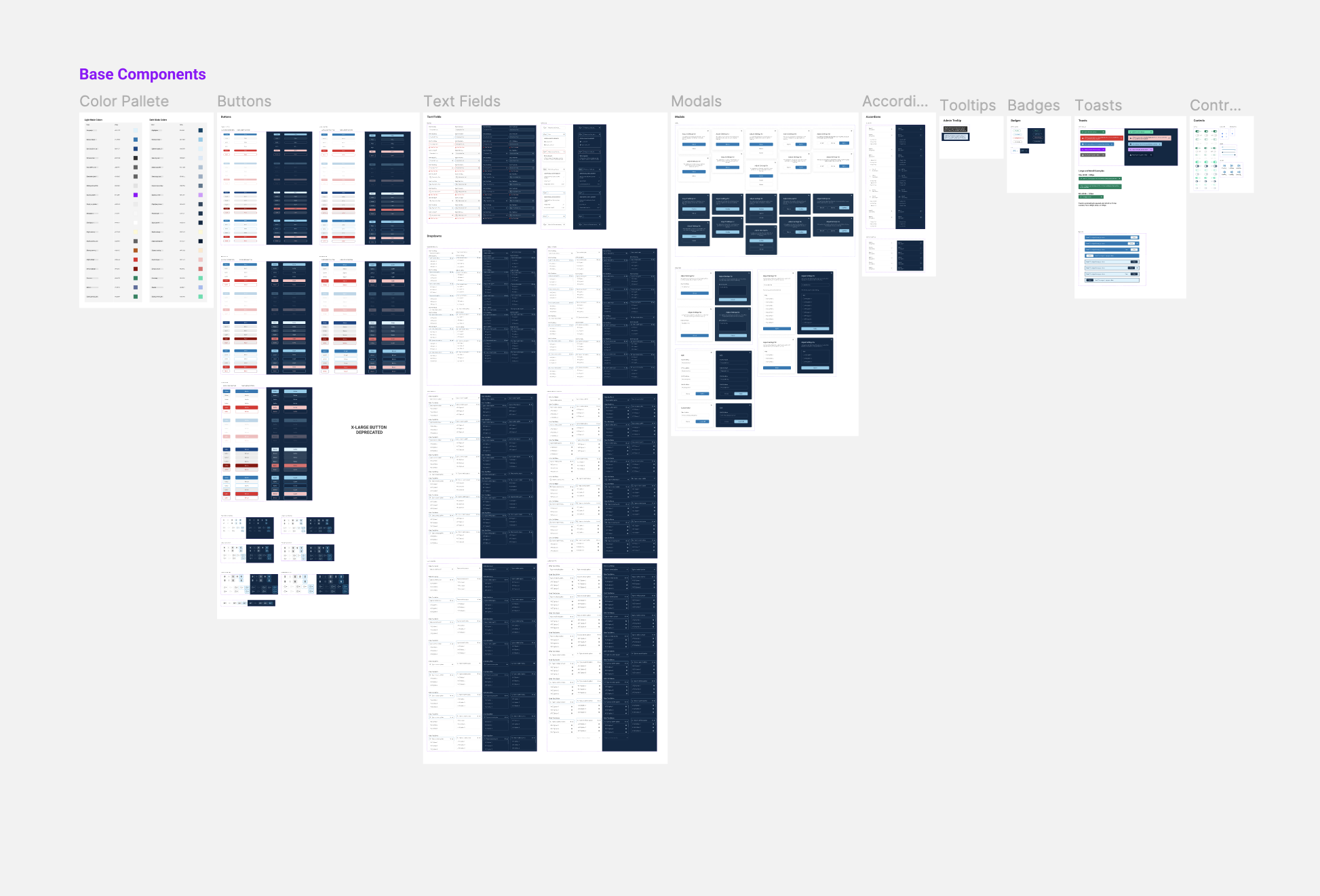
We worked with the staff designers to dig deep into the components that engineers had created in Storybook and built these components in Figma. The result would become our Core Design Library.
Design System Principles
In making decisions about how to implement the Design System, we needed some guiding principles to remind us why we are doing this work and what outcome we were trying to achieve. We agreed on a few basic principles:
- Match the product as it exists now, not fold in improvements we hoped would one day be implemented. While it is painful for designers to perpetuate some sub-optimal design implementations, it was more important to have our source of truth match the product for consistency.
- Match the naming of the components for easy reference in discussions with engineers. While the existing naming the engineers chose was neither strategic nor normalized, it was more important to start speaking the same language across functions.
- Organize components into pages for ones that already exist in the codebase versus ones that we hoped to add later. We also separated out components that were useful in our design process, but not necessarily needed in the codebase. This helped us more clearly understand the feasibility of our designs going into conversations with engineers.
Design System Council
A Design System is only as good as the collaboration of the designers and engineers. We established a recurring cross-functional session in which we would discuss new components, deprecations, snowflakes and overall maintenance. This ceremony led to a tighter connection between the design libraries and the codebase, which improved the product quality, as well as better planning conversations around coming features.
The Outcome
- Better and faster conversations about feature feasibility, having laid the groundwork in Design System Council sessions.
- More consistency across the products. Designers were now primarily drawing from built components, improving system-level thinking in the design process.
- Faster design and development cycles. With both designers and engineers using established building blocks to generate UI, everything went much faster.
- Streamlined support for various products. With clearly defined libraries for different products, breaking changes dependencies were more apparent and unintended consequences more rare.